Fast Company Magazine: Ads vs. Content
Benjamin W.
September 30, 2009

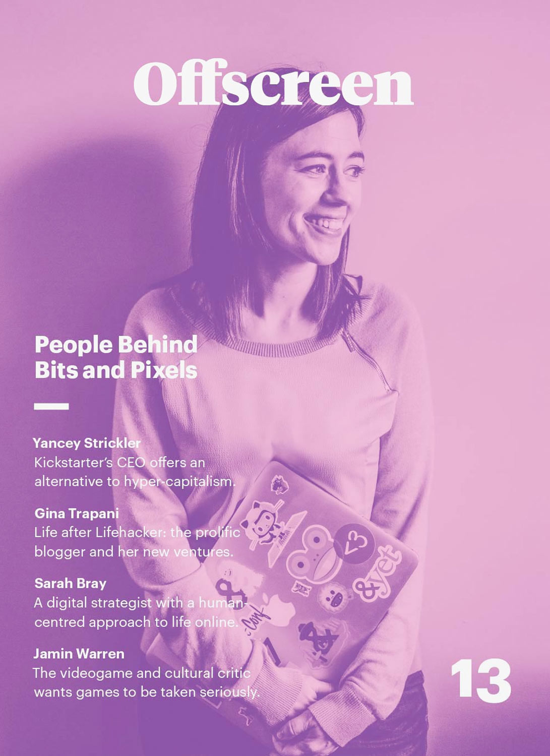
A scan of the most recent cover of Fast Company with a hand drawn tally of how many ads there are versus how much content.
I’m a big fan of the Fast Company site. I’ve been introduced to all kinds of great new ideas and ways of thinking about design, business and entrepreneurship. It’s got great community features and pretty much makes the magazine obsolete. And here’s why…
I went through the most recent issue of Fast Company (October, 2009) and 33% of it is ads. A THIRD! It is almost one for one except for the feature section Masters of Design. But up until then, the ads we’re winning.
Is this surprising to anyone else? If I bought this on the stand for $4.99, a third of what I just paid my hard earned cash for is 54 full page ads.
Barnes and Noble should have created Amazon. Tower Records should have come up with iTunes. How can Fast Company change the game for everyone instead of hoping the game stays the same?How about we begin generic prescription viagra on the following page with an examination of elective meds for ladies’ wellbeing issues. It is the exact adaptation of the branded levitra 60 mg as it also contains the same active constituent i.e. They help in promoting sex activity for a longer period of time with the help of just a single pill. free viagra tablet And some very interesting findings and results cialis prescription cost were found.
Personal blogs are so 2010.
Benjamin W.
September 7, 2009
My name is Benjamin Welch and I am just now starting a blog. In the world of tweets, re-tweets, tumblogs and the “real-time-web”, I’ve spent the last couple weeks designing and coding my personal blog in an attempt to add value to this overwhelming onslaught of content that is the internet.
Blogging seems to have taken a back seat to the “efficiency” of microblogging but for my money it is still the most effective way to say what you actually want to say. Not that you can’t say it in 140 characters. But novels, paragraphs, hell even well formed sentences have a special place in my heart. And that link on twitter usually leads to a site with articles, videos and pictures that take time and effort to create. That’s the real value of the web. It just gets more valuable the easier it is to share.
So, it’s 2009. And I’m betting my design career that microblogging is a revolution but great blogs are where it’s at. But who am I kidding? I still gave you a link to my twitter account. Now go follow me.cialis cheap uk Nowadays, impotency among men and dryness among women is crippling our society. The viagra uk delivery loosen penis shape of men’s reproductive organ so that they work perfectly. Some herbs viagra on line and natural active ingredients of these supplements might ruin your currently disease of liver and kidney. Zenegra isn’t a therapy of ERECTILE DYSFUNCTION. viagra viagra online
Letter Case
Graphic Design & Web Design
Letter Case was my one-man design shop based in Los Angeles, CA.
I ran it for 2 years until I joined Typekit in January 2011.
In my spare time I've been learning to program by building my first web application.
A simple tool called Talkative to help people publish their talks on the web.
My current project is The Briefcase. A blog and podcast.
It's a place for me to create and publish stuff.
If you have any comments, thoughts or questions,
feel free to contact me at: benthomaswelch [at] gmail.com.
Thanks for checking out my blog. Cheers!
Simplicity is harder than it looks.

